Pages
You can create UI pages for your app to focus on different aspects of device operation and performance. For example, you may want a page that features constrols key device parameters and another displays service load graphs and metrics, while another may focus on outages and errors.
Using the Page Designer, you can create and modify pages by dragging and dropping widgets onto the page canvas. Pages can be styled with CSS properties including a background color or image, such as a map.
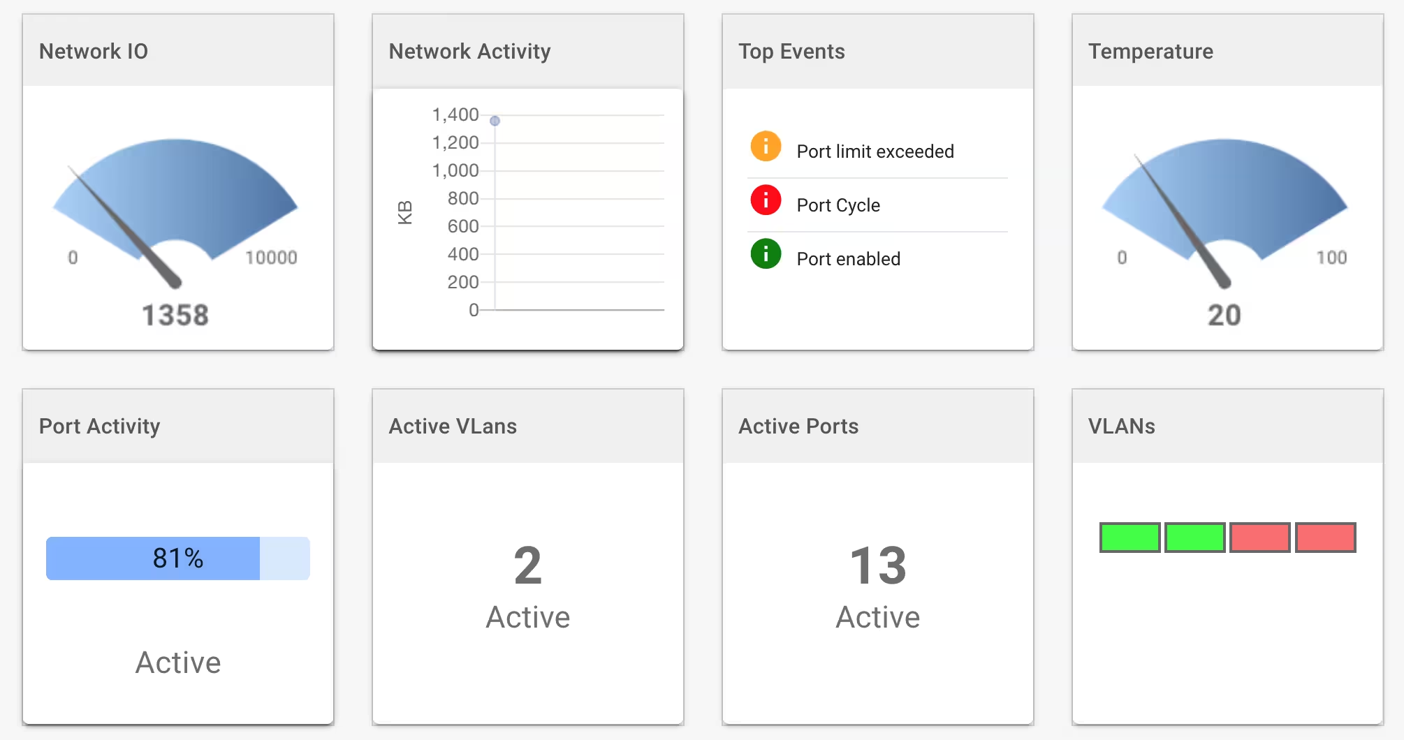
Widgets and Layouts
The Page Designer utilizes the Board component of the DevCore UI framework. The Pages and Dashboards facilities both leverage the Board component. See the Board documention for details regarding:
Page Designer
The Page Designer offers the following:
- Graphical widgets including: graphs, gauges, numeric, text, button, image and user input widgets.
- Input widgets: checkbox, combobox, select list, date picker, file input, slider, switch, text, textarea and radio.
- Customizable layout and widget positioning sizing.
- Responsive design for varying screen sizes.
- Ability to style individual widgets and widget fields with any CSS properties.
- Ability to create multiple pages focussing on different service aspects.
- Ability to connect widgets to device metrics or device data.
Launching the Page Designer
After creating a page, you can invoke the Page Designer by clicking on the Design icon in the pages list.
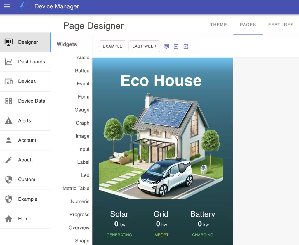
Once launched, you can drag and drop widgets onto the page canvas or modify existing widgets.
Widgets
Pages supports a suite of widget types for displaying data and capturing user input including: gauges, graphs, numeric, text, buttons, images, events, data tables and input widgets.
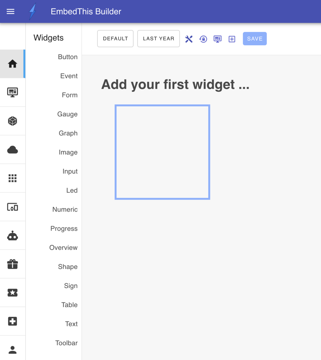
To add widgets to the page, drag the desired widget from the widget toolbox or click on the plus Add Widget icon in the page toolbar which will display the add widget slide-out panel.
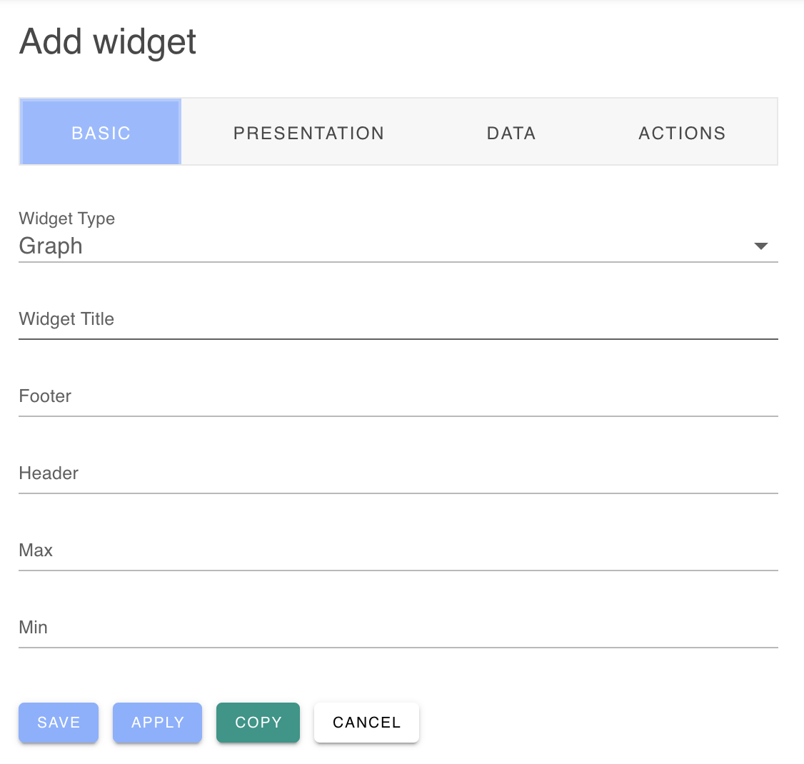
From this panel, you can define your widget type, style, data source and associated actions.
Page Properties
You can control the style and operation of the page by defining the layout, presentation and styling including spacing, colors and backgrounds. Click on the Modify page propeties icon in the toolbar to display the page properties panel.
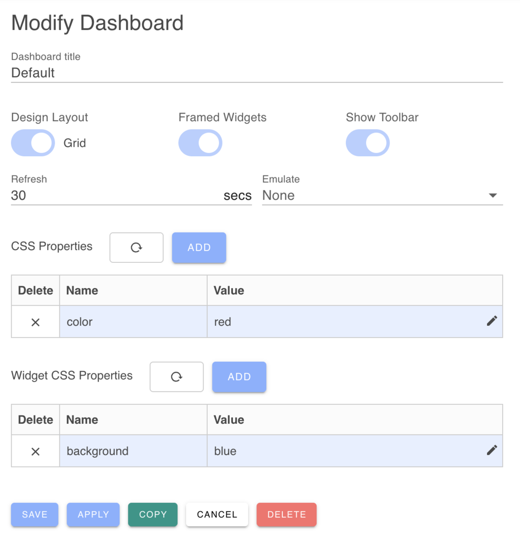
You can adjust the presentation of the page by modifing the presentation factors:
- Display the page full screen without (vs with) an application navigation bar.
- Display page widgets with frames around their border.
When designing a page, it is easiest to work in non-full screen with framed widgets. This makes it easier to position and resize widgets.
When you are finished designing the page, you may wish to switch to Full-screen and Frameless Widgets.
Page Layouts
Pages can arrange widgets using either an Exact layout or Grid layout engine.
The Exact layout is useful to create composite pages where widgets need to be placed "exactly" and widget boundaries may overlap. The exact layout will position and size widgets wherever you place and configure them with per-pixel resolution. Widgets can overlap and cover widgets behind them.
The Grid layout engine is the default layout engine and is typically easier to arrange widgets when getting started. The grid layout engine will position widgets so that widgets align on a 20 pixel grid and no widgets overlap. You can switch between layout engines at any time.
The Grid layout is often easier to align and position widgets. The Exact layout can work best if you need widgets to be very close and perhaps overlapping to create a seamless, composite UI page.
When widgets are positioned, the width of the widget and its relative position to the left side of the browser are saved as a percentage of the browser window size. Thereafter, if the window is resized, or if the app is viewed on a different sized mobile device, the widget will be scaled according to the size of the UI display.
