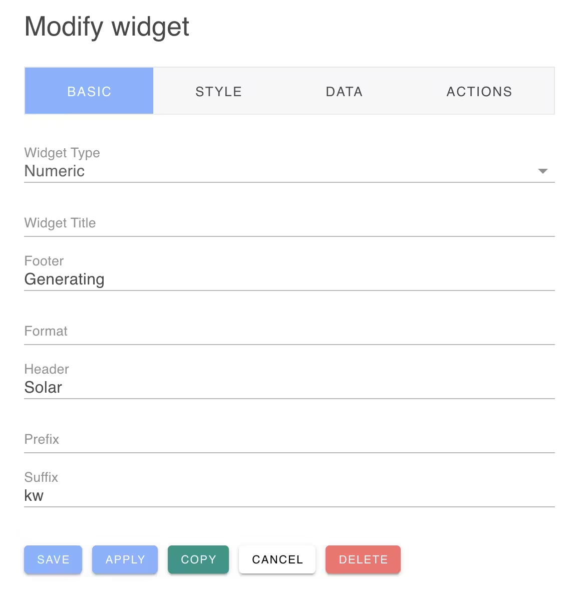
Basic Widget Configuration
The Basic widget configuration includes the widget type, title and other fields that are relevant for the selected widget type.

Depending on the widget type, different configuration fields will be presented from the following list:
| Name | Description |
|---|---|
| accept | File types to accept for the File upload widget |
| datetime | Set to "date", "time" or "datetime" for the date input widget. |
| field | Database field to update for input widgets |
| fields | Database fields to display for table widgets |
| footer | Widget footer to display at the bottom of the widget |
| form | Associated form widget to post input form fields |
| format | Widget numeric format string |
| header | Widget header text to display at the top of the widget |
| items | Selection items to use with input select and combo widgets |
| label | Input field label |
| max | Maximum expected data value |
| min | Minimum expected data value |
| multiple | Allow multiple selections for an input combo widget |
| pivot | Pivot the table widget data. Rows vs columns. |
| placeholder | Place holder text to use for input text widgets. |
| prefix | Text prefix to display before the value for numeric widgets. |
| presentation | Graph presentation. |
| rows | Numer of rows to display for a text area input widget |
| subtitle | Subtitle to display for the table widget |
| suffix | Suffix text to display after a numeric value |
| text | Static text to use for the widget value |
| timezone | Timezone to use for the date input wiget |
| url | URL to use for image and sound widgets |
| validate | Regular expression to use for validating text inputs. |
Formatting Numerics
The format field is used when formatting numberic widgets.
For example, the following will format numbers with an optional sign followed by the number portion with thousand separators and one decimal place. The number will be rounded up.
-0#,###.#^The formatter characters are:
| Character | Description |
|---|---|
| 0 | digits with leading zero |
| digit
, | Thousand separators % | format as percent
- | Always show sign
- | Show sign if negative ^ | Round up v | Round down
