Dashboard Layouts

Each Dashboard has the choice of using one of two layout engines:
| Name | Description |
|---|---|
| Exact | Layout widgets with exact positioning |
| Grid | Layout widgets on a grid |
Exact Layout
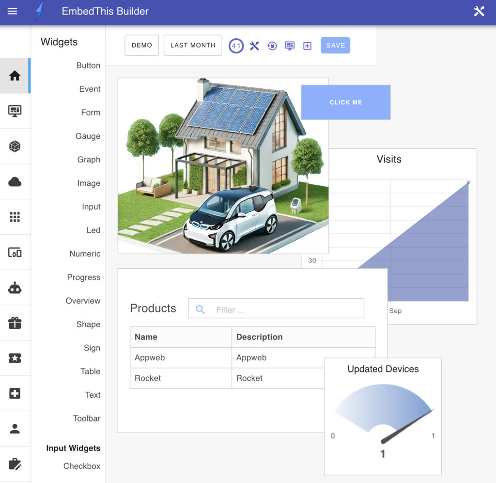
The Exact layout engine will position and size widgets wherever you place and configure them with per-pixel resolution. Widgets can overlap and cover widgets behind them. The exact layout does not use a grid.

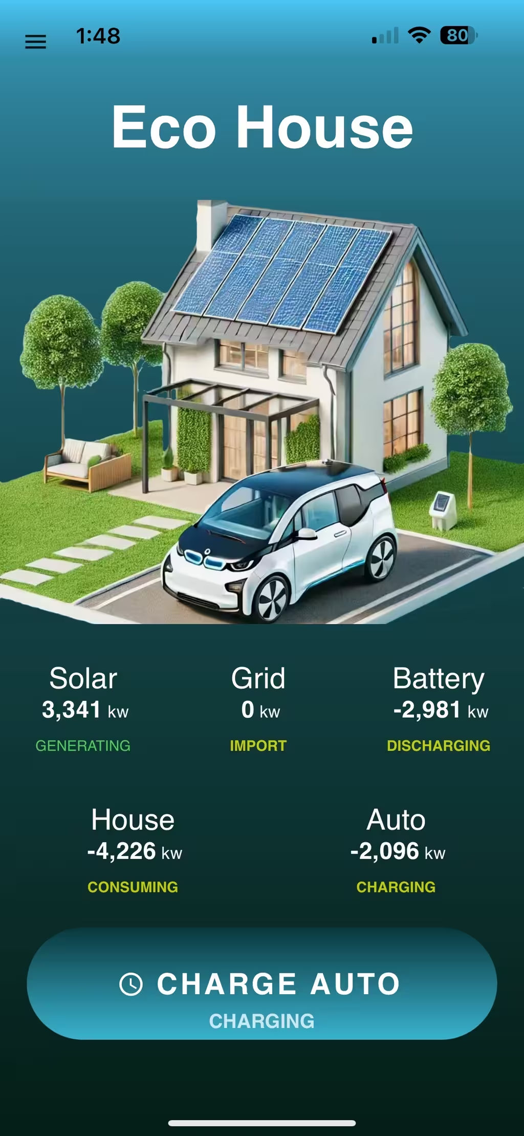
The exact layout is useful to create composite pages where widget boundaries are not visible (using frameless widgets). For example:

Grid Layout
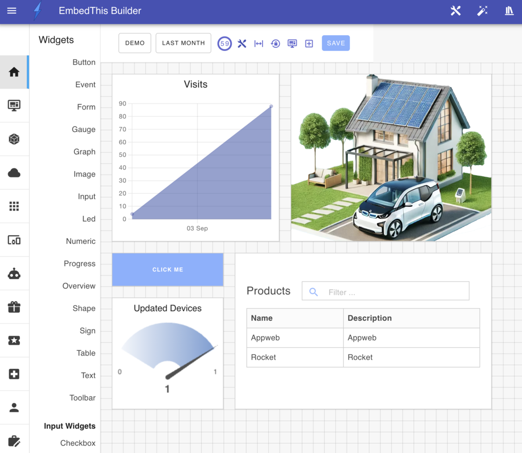
The Grid layout engine is the default layout engine and is typically easier to arrange widgets. The grid layout engine will position widgets so that widgets align on a 20 pixel grid and no widgets overlap.

Widget Placement
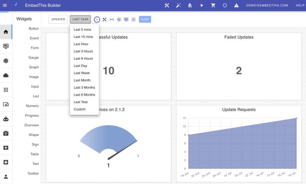
You can adjust the position of widgets on the dashboard by moving and resizing widgets. To move a widget, click the widget and drag it to a new location. To resize a widget, click and drag the resize handle located at the bottom right corner to your preferred size. If you are using the grid layout, the dashboard automatically rearranges other widgets to prevent overlap and ensure clear visibility. If you are using the exact layout engine, widgets will be placed exactly where you position them.
If widgets are moved, a Save button will appear in the widget toolbar. Click Save to persist your changes, click the Reset icon to discard your changes.
Expanding Widgets
If you are using the grid layout, you can click an Expand icon in the dashboard toolbar to stretch widgets to the full width of the display and remove redundant white space. This will align widgets on the left and the right of the dashboard. This is useful to quickly align and apportion a grid of widgets.
Zooming a Widget
If you Cmd-Click a widget, it will be zoomed to full screen display. Press the escape key to restore the widget to normal size.
Responsive Design
When widgets are positioned, the relative position to the left side of the browser, and the width of the widget are save as a percentage of the browser window size. Thereafter, if the window is resized, or if the app is viewed on a different sized mobile device, the widget will be scaled according to the size of the device. This permits a single dashboard design to scale for widely different user interface dimensions.
