Manager Display
The Device Manager's user interface can be extensively customized with your logo, product name, color and font theme, device data and device specific screens, interfaces and custom logic.
Configuring the Manager
The Device Manager is controlled by a JSON configuration file called display.json5 that can be modified to suit your specific needs.
The display.json5 file defines the following items:
- Displayed Name
- Display color theme including dark and light modes
- Menu items and options
- UI pages
- Data tables and fields
- Device data edit property panels
- Dashboard data and widgets to display
Here is a subset example of a display.json5 file:
The Standard Device Manager display.json5 can be found in the Ioto agent download in the file:
1 | |
Quick tour
A minimal display.json5 will consist of some top level properties, and a set of views.
For Example
The title is used as the application title in the navigation bar.
The version and description are for documentation.
The views define one or more views. If a view has sidebar set to true, the Manager sidebar will display the view icon to launch the view.
Navigation
The manager provides two axes of navigation:
- Side bar for top-level items
- Horizontal tabs below the navigation bar
The sidebar is populated with items that have "sidebar" set to true. The horizontal tab menu is built from child views under the parent view.
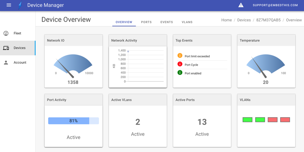
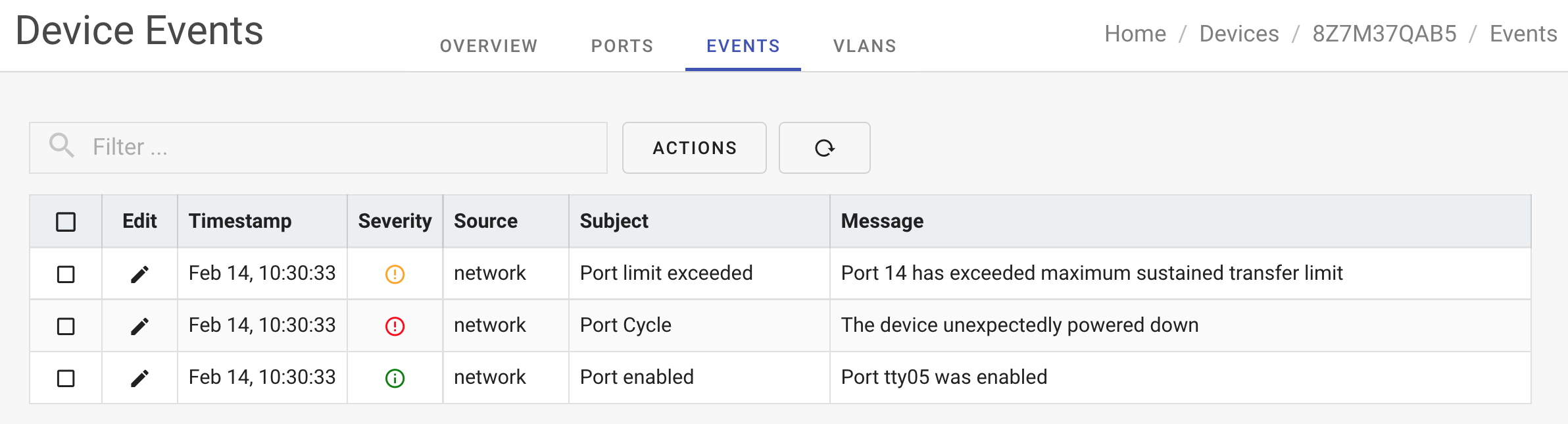
In the example image above, the sidebar has the "Fleet", "Device" and "Account" menu options. With the selected "Device" sidebar item, the horizontal tab menu displays: "Overview", "Ports", "Events" and "Vlans".
Views
The Manager defines UI pages based on the declared views. Each view is a displayable page for a specific browser URL.
The view defines a name, navigation path and typically a rendering component.
If a view defines child views under a "views" property, those child views are presented as tabbed menu options under the parent view.
Views may define a redirect property to redirect the browser to another target view.
Table Views
The Manager provides a GenericList component that can be used to display device data as a table.
The Manager table component is a powerful VueJS component that can:
- Display data in pages
- Select data items for operations
- Select data via a search box
- Resize columns
- Reorder columns with drag and drop
Table views present data items that can be selected via checkboxes or by clicking on table cells. The display.json5 table definitions can specify how to respond to item selection and cell clicks via actions.
An actions definition will specify which panels to launch or components to run when the relevant action is invoked.
In this example: when a row in the table is clicked, the wild-card field definition ("*") will cause the browser will be redirected to the /devices/ID/overview page.
If table items are selected, depending on the count of items selected, the appropriate action will cause a panel to be "launched" or component to be "invoked" as required.
Custom Views
Instead of using the GenericList component for a tabular view, you can create custom VueJS components to extend the Manager. You can upload a custom components package using the Builder Cloud/Edit panel.
Custom views can be any VueJS page of your design -- the sky's the limit.
Panels
To facilitate editing the properties of a data item, the Manager defines UI Panels.
A parent view may define zero or more panels that can be invoked to operate up selected data items from the parent view.
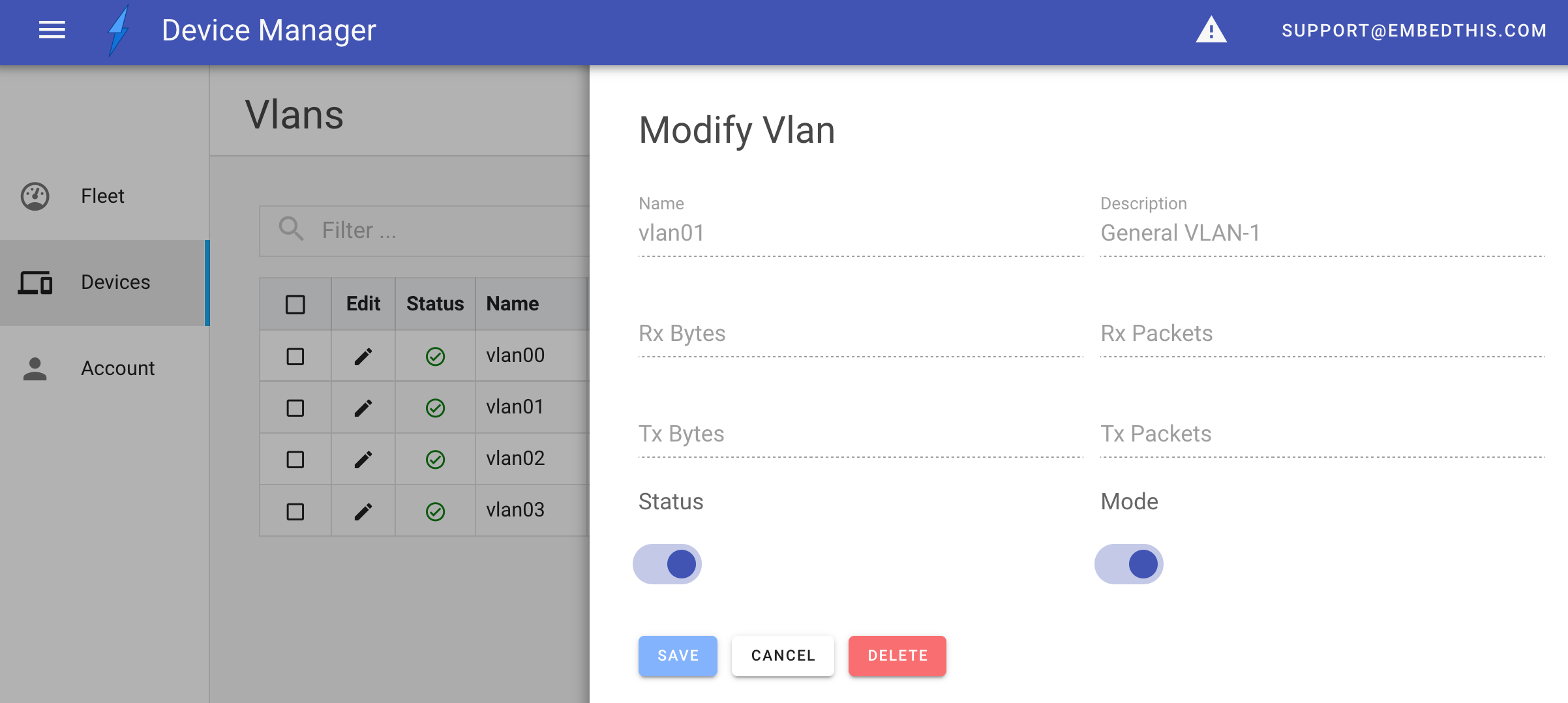
The panel will animate and slide out from the right side of the screen when launched by a view action or button.
Panels are defined under a views panels property.
A panel has a name and a component to render and operate the panel. It may specify a button which will be added to the parent view table to launch the panel.
Alternatively, panels may be launched via view table actions.
Dashboards
The Manager has a Dashboard component that can be used in any view to provide a graphical display of relevant device data.
The Dashboard displays a set of widgets, each of which presents a facet of device data you wish to display.
The supported widget types are:
- event
- gauge
- graph
- led
- numeric
- progress
- text
- time
Widgets on the dashboard can be rearranged by the user using drag-n-drop and will be persisted in that order for their browser.
Authorizing Access
It is frequently required to only display or allow the ability to modify certain parts of a management application. For example, you may only want administrators to be able to delete certain resources.
The Manager allows the visibility of views, panels, table columns and panel fields to be controlled depending on the user's authorized role.
By specifying a role property, you can require that the user have at least this capability to access the designated element.
For example, to only allow access to a view by adminstrators:
References
- The default device schema can be found in the Ioto agent download in the file: apps/manager/config/schema.json5
- The Standard Device Manager display.json5 can be found in the Ioto agent download in the file: apps/manager/config/display.json5