Manager Display Properties
Here is a subset example of a display.json5 file:
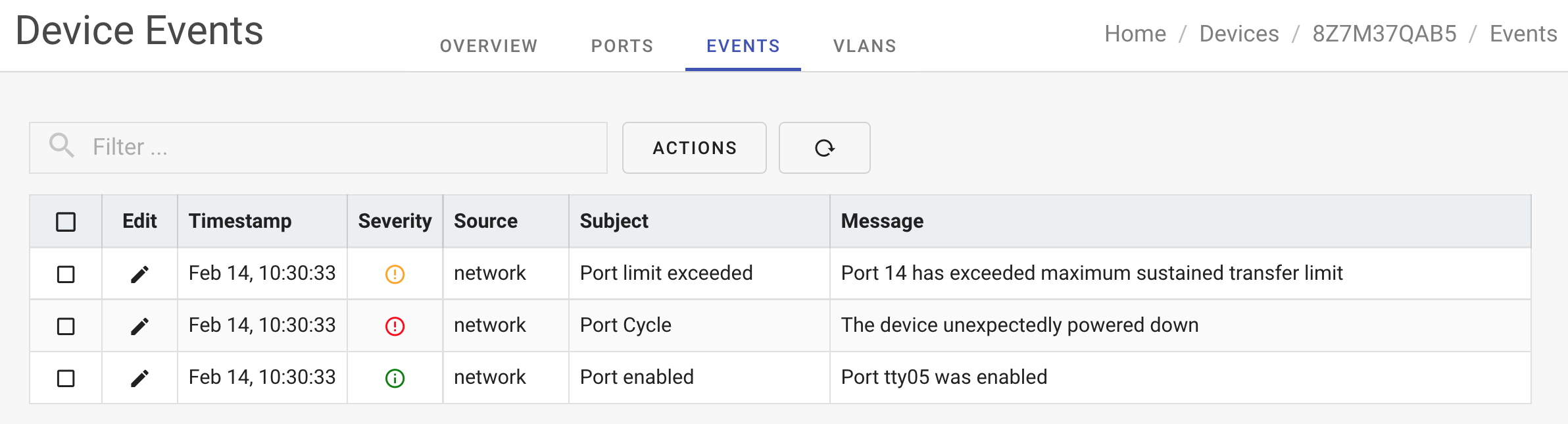
Here is an example view that uses the dashboard component and informational widgets:
Manager Properties
description
| Name | description |
|---|---|
| Description | Textual description of the device. |
| Synopsis | description: "Short, one sentence description" |
Example
features
| Name | features |
|---|---|
| Description | Enable features for the display UI |
| Synopsis | features: { "debug": true | false } |
Example
features.auth
| Name | features |
|---|---|
| Description | Authentication features for the display UI |
| Synopsis | auth: { "social": true | false } |
Example
| Property | Description |
|---|---|
| forgot | Support forgot my password recovery |
| login | Display and require user login |
| social | Support login via Google, Facebook or Amazon. (Requires cloud-based managemement). |
features.demo
| Name | features |
|---|---|
| Description | Enable demonstration mode |
| Synopsis | demo: true | false |
features.debug
| Name | features |
|---|---|
| Description | Enable debug mode |
| Synopsis | debug: true | false |
This is useful to enable or disable debug code while developing new features.
features.cloud
| Name | features |
|---|---|
| Description | Control cloud features |
| Synopsis | cloud: { multiple: true | false } |
This is useful to support apps that can connect to multiple device clouds.
features.dash
| Name | features |
|---|---|
| Description | Control dashboard features |
| Synopsis | dash: { edit: true | false } |
This property collection controls the widget dashboard.
The following properties are supported
| Property | Type | Description |
|---|---|---|
| edit | Boolean | Enable the widget editing panel |
| database | Boolean | Enable widgets to access database fields |
| metrics | Boolean | Enable widgets to access metrics |
| multiple | Boolean | Enable support for multiple dashboards per user |
features.nav
| Name | features |
|---|---|
| Description | Control app navigation features |
| Synopsis | nav: { sidebar: true } |
This property collection controls the app's navigation features. The following properties are supported:
| Property | Type | Description |
|---|---|---|
| cookies | String | Reserved |
| doc | String | URL link to app documentation site |
| fleet | Boolean|String | Support multiple claimed devices in the one UI. Can be set to 'smart' to dynamically determine based on the number of claimed devices. |
| help | Boolean | Reserved |
| profile | Boolean | Display user profile in top navbar menu |
| settings | Boolean | Display account settings in top navbar menu |
| sidebar | Boolean | Display navigation sidebar |
| navbar | Boolean | Enable top of application navbar |
redirect
| Name | redirect |
|---|---|
| Description | Redirect the browser to a new location |
| Synopsis | redirect: "URL" |
| Notes | If set to a URL, you can use :token segments that will be expanded at runtime from the application route context. |
Example
The :deviceId will be replaced with the selected device ID from the device list.
theme
| Name | theme |
|---|---|
| Description | Define the display theme configuration |
| Synopsis | theme: { properties ... } |
Example
theme.logo
| Name | theme.logo |
|---|---|
| Description | The logo displayed in the navigation bar and login screen. |
| Synopsis | logo: "/images/NAME.png" |
| Notes | The logo should be small, square and have a transparent background. |
theme.title
| Name | theme.title |
|---|---|
| Description | The device title displayed in the navigation bar. |
| Synopsis | title: "Few word title" |
theme.themes
| Name | theme.themes |
|---|---|
| Description | Set of colors to use for the dark and light UI themes. |
| Synopsis | `themes: { dark: {...}, light: {...}} |
| Notes | The themes collection should provide a "dark" and "light" mode set of colors. |
timeouts
| Name | timeouts |
|---|---|
| Description | Define timeout periods for various manager refresh tasks. |
| Synopsis | timeouts: { dashboard: seconds } |
| Note | The dashboard time governs how frequently dashboard widgets are updated. You can provide a numeric value in seconds or a textual value such as "3secs". |
Example
version
| Name | version |
|---|---|
| Description | The version number of your display.json5 file (SemVer). |
| Synopsis | version: "SemVer compatible version" |
Example
views
| Name | views |
|---|---|
| Description | Array of UI pages to define |
| Synopsis | views: [ { view }, ...] |
| Note | Views may also be nested under a view. Such nested views are presented as tabbed views under a common parent view. |
Example
view.component
| Name | view.component |
|---|---|
| Description | VueJS component to display for the view |
| Synopsis | component: "ComponentName" |
| Note | The component can be an inbuilt Ioto Manager component or it can be a component provided by the extension components defined via the modules property. The inbuilt components are listed below. |
Example
Inbuilt VueJS Components
These components can be referenced in the display.json5 file.
- AccountSettings
- Dashboard
- GenericList
- GenericEdit
- DeviceClaim
- DeviceClaimModal
- DeviceRelease
- Forgot
- Login
- UserPassword
- UserList
- UserProfile
view.enable
| Name | view.enble |
|---|---|
| Description | Enable or disable the view |
| Synopsis | enable: true | false | array | object |
May be set to true or false to statically enable or disable a view.
May be set to an array or map of properties for dynamic control based on the app context.
If set to an array, each array map element must evaluate to true. If set to a map of properties, any one of the properties must be true to enable the view.
Map property values can be literal strings, numbers, booleans or regular expressions. Regular expressions are defined as strings delimited by slash characters. For example: "/Some Regular Expression/". Strings can also be prefixed with an operation: < <= > >= == !=.
Property values are derrived by using the property name as an index into the app context. i.e.:
Currently, the app context contains the device ID as the "deviceId property. Additional properties can be added to the context via the API:
1 | |
Example
view.height
| Name | view.height |
|---|---|
| Description | Default view widget height |
| Synopsis | height: Pixels |
| Note | This defines the default height for the view's widgets |
Example
view.icon
| Name | view.icon |
|---|---|
| Description | Icon to display in menus |
| Synopsis | icon: "mdi-NAME" |
| Note | The icon name is the name of an icon alias. You should use the icon alias name with an "$" prefix. |
Example
The Manager class provides a subset of the Material Design Icons. Applications can import and add additional aliases when initializing the Manager class.
The following icon aliases are provided as standard:
| Icon Alias | Icon Name |
|---|---|
| account | account |
| alert | alert |
| auto | brightnessauto |
| aws | aws |
| bell | bell |
| bookmark | bookmarkmultiple |
| bookshelf | bookshelf |
| bridge | bridge |
| calendar | calendar |
| cancel | close-circle |
| checkboxindeterminate | minus-box |
| checkboxoff | checkbox-blank-outline |
| checkboxon | checkbox-marked |
| clear | close-circle |
| cart | cart |
| click | cursordefaultclick |
| clipboard | clipboardtext |
| clock | clockoutline |
| cloud | cloud |
| close | close |
| cog | cog |
| cogoutline | cogoutline |
| collapse | chevron-up |
| complete | check |
| copy | contentcopy |
| critical | flash |
| cube | cubesend |
| dark | brightness3 |
| dashboard | monitordashboard |
| delete | close-circle |
| delimiter | circle |
| devices | devices |
| down | chevrondown |
| download | download |
| dropdown | menu-down |
| edit | pencil |
| error | close-circle |
| expand | chevron-down |
| error | alertcircleoutline |
| eye | eye |
| eyedropper | eyedropper |
| eyeoff | eyeoff |
| function | function |
| file | paperclip |
| first | page-first |
| gauge | gauge |
| grid | viewgridoutline |
| info | information |
| last | page-last |
| lan | lan |
| launch | launch |
| leftarrow | arrowleftbold |
| light | brightness5 |
| login | login |
| loading | cached |
| menu | menu |
| minus | minus |
| next | chevron-right |
| plus | plus |
| magnify | magnify |
| medical | medicalbag |
| monitor | monitor |
| offline | flashoutline |
| online | checkcircleoutline |
| open | lockopen |
| phone | phone |
| play | play |
| plusboxoutline | plusboxoutline |
| prev | chevron-left |
| radiooff | radiobox-blank |
| radioon | radiobox-marked |
| ratingempty | star-outline |
| ratingfull | star |
| ratinghalf | star-half-full |
| rightarrow | arrowrightbold |
| reload | reload |
| redo | redo |
| resize | resizebottomright |
| rss | rss |
| run | run |
| sortasc | arrow-up |
| sortdesc | arrow-down |
| security | security |
| send | send |
| start | raystartarrow |
| stop | stop |
| support | hospitalbox |
| swap | swapverticalbold |
| subgroup | menu-down |
| success | check-circle |
| tap | gesturetapbutton |
| up | chevronup |
| unfold | unfold-more-horizontal |
| warning | alert-circlewarn |
| wizard | autofix |
| wrench | wrench |
To add icons when initializing the Manager, import the icons and add to the vuetifyProps when calling createVuetify.
And then supply the icons when calling
view.menu
| Name | view.menu |
|---|---|
| Description | Display the view in the sidebar menu with the given text |
| Synopsis | menu: 'MenuTitle |
Example
view.name
| Name | view.name |
|---|---|
| Description | Name of the view |
| Synopsis | name: "One-word-name" |
| Note | This name is used in several places including as a page title and VueJS route name. |
Example
view.panels
| Name | view.panels |
|---|---|
| Description | Array of slide in panels that overlay the view. |
| Synopsis | panels: [ { panel }, ...] |
| Note | Panels are defined inside a parent view. Panels are invoked via buttons defined in the panel properties that are displayed in the parent view. A typical use case is a parent view list of device components and a panel to edit a selected component. For example: from a parent view of device fans, a fan could be selected and an edit panel could modify the fan's operational properties. |
Example
view.panel.button
| Name | view.panel.button |
|---|---|
| Description | Button text to display in the parent view's table. |
| Synopsis | role: "User-role" |
| Notes | The button will be automatically displayed by panel view parents that use the GenericList component. If you are using a custom view parent component, you will need to manage the buttons display in that component. |
Example
view.panel.component
| Name | view.panel.component |
|---|---|
| Description | VueJS component to display for the panel |
| Synopsis | component: "ComponentName" |
| Note | The component can be an inbuilt Ioto Manager component or it can be a component provided by the extension components defined via the modules property. The inbuilt components are listed below. |
Example
view.panel.fields
| Name | view.panel.fields |
|---|---|
| Description | Array of fields to edit |
| Synopsis | fields: [ {field definition}, ...] |
| Note | This defines an array of fields to edit when using the GenericEdit component. Input fields have a defined "type" which determines the HTML component used to edit the field value. Supported field types include: checkbox, combo, date, label, password, radio, select, slider, switch, text and textarea. |
Example
view.panel.fields.label
| Name | view.panel.fields.label |
|---|---|
| Description | Field displayed label |
| Synopsis | label: "fieldLabel" |
| Note | The field label is displayed before the input field. If not provided, the field name is converted to PascalCase and used by default. |
Example
view.panel.fields.name
| Name | view.panel.fields.name |
|---|---|
| Description | Field name |
| Synopsis | name: "oneWordName" |
| Note | If a field title is not provided, the field name is converted to PascalCase and is used as the input field title. |
Example
view.panel.fields.role
| Name | view.panel.fields.role |
|---|---|
| Description | Required user role to display the field |
| Synopsis | role: "User-role" |
| Notes | The user role may be selected from "public", "user", "admin", "support" or "owner". The public role permits unauthenticated access. The other roles require a login with the requisite role. |
Example
view.panel.fields.select
| Name | view.panel.fields.select |
|---|---|
| Description | Selectable options for switch fields. |
| Synopsis | select: {options, ...} |
Example
view.panel.fields.type
| Name | view.panel.fields.type |
|---|---|
| Description | Field's input UI display type |
| Synopsis | type: "Type" |
| Note | If the type is not provided, the Manager attempts to sleuth the type based on the data value provided to edit. |
Example
**The supported panel field data types are:
checkbox combo date label password radio select slider switch text ** textarea
view.panel.fields.width
| Name | view.panel.fields.width |
|---|---|
| Description | Number of columns the input field should occupy. |
| Synopsis | width: "1-12" |
| Note | The width is expressed as a number of columns between 1 and 12. The GenericEdit component uses a layout grid of 12 columns. GenericEdit will pack fields to fill a row, before starting a new display row. |
Example
view.panel.name
| Name | view.panel.name |
|---|---|
| Description | Unique panel name |
| Synopsis | name: "Name" |
Example
view.panel.role
| Name | view.panel.role |
|---|---|
| Description | Required user role to allow access |
| Synopsis | role: "User-role" |
| Notes | The user role may be selected from "public", "user", "admin", "support" or "owner". The public role permits unauthenticated access. The other roles require a login with the requisite role. |
Example
view.panel.title
| Name | view.panel.title |
|---|---|
| Description | Panel Title |
| Synopsis | title: "Title" |
| Notes | If the panel title is not provided, a title is created using the name of the model defined in the parent view table property. The model name is prefixed with 'Create' or 'Modify' as appropriate. For example, if the model was "Port" and an existing port item was selected in the table, the panel title would be "Modify Port". |
Example
view.panel.width
| Name | view.panel.width |
|---|---|
| Description | Display width of the panel |
| Synopsis | width: "NNpx" |
| Notes | The default panel width is 700px. |
Example
view.path
| Name | view.path |
|---|---|
| Description | URL path for the view |
| Synopsis | path: "/URL/PATH" |
| Note | The URL path is used by VueJS when constructing the app routes and at runtime for navigating the views. |
Example
view.refresh
| Name | view.refresh |
|---|---|
| Description | Update period to refresh the view's data |
| Synopsis | refresh: Number | "period" |
| Notes | This is the period for refreshable components to update their data. The period may be a number of seconds or a string equivalent. |
Example
view.role
| Name | view.role |
|---|---|
| Description | Required user role to allow access |
| Synopsis | role: "User-role" |
| Notes | The user role may be selected from "public", "user", "admin", "support" or "owner". The public role permits unauthenticated access. The other roles require a login with the requisite role. |
Example
view.table
| Name | view.table |
|---|---|
| Description | View data table definition |
| Synopsis | table: {table-properties} |
| Note | The GenericList component displays database model items as a table. The table can be extensively customized by table properties. |
Background
The table is displayed by retrieving items from the table.model database model type. The columns of the table are defined via the table.fields and are displayed in order. Table action menu options are derived from the table.actions collection with buttons from any relevant view panels.
Data Table
Example
This example formats the image above:
view.table.actions
| Name | view.table.actions |
|---|---|
| Description | Actions that can be performed on selected table items. |
| Synopsis | actions: { action, ...} |
| Notes | The action collection has one or more action definitions. Each definition is a set of properties that scopes how many items can be manipulated (count), the view panel to display (panel), if user confirmation is required before taking the action (confirm) and whether a launch button should be displayed (launch). |
Example
view.table.actions.confirm
| Name | view.table.actions.confirm |
|---|---|
| Description | Display a dialog requesting user confirmation before invoking the action. |
| Synopsis | confirm: true | false |
Example
view.table.actions.count
| Name | view.table.actions.count |
|---|---|
| Description | Number of selected items the action supports. |
| Synopsis | count: Number |
| Notes | Set count to 0 for "add" actions that require no selected items. Set count to 1 for actions that can operate on only 1 item at a time. Set count to 2 for actions that can operation on multiple selected items. |
Example
view.table.actions.invoke
| Name | view.table.actions.invoke |
|---|---|
| Description | Panel name to display or URL to navigate to when the action is invoked |
| Synopsis | invoke: "ComponentName" |
| Notes | The invoke property defines a VueJS component that will be invoked when the action is triggered. The component will be passed properties containing the data item (item) and the data model (model). |
Example
view.table.actions.launch
| Name | view.table.actions.launch |
|---|---|
| Description | Panel name to display or URL to navigate to when the action is invoked |
| Synopsis | launch: "PanelName" | "URL" |
| Notes | If set to a URL, you can use :token segments that will be expanded at runtime from the application route context. |
Example
view.table.actions.panel
| Name | view.table.actions.panel |
|---|---|
| Description | Panel to display when the action is invoked |
| Synopsis | panel: "PanelName" |
| Notes | Panels can only be used for actions of count 0 or 1. |
Example
view.table.fields
| Name | view.table.fields |
|---|---|
| Description | Define the table fields (columns) to display. |
| Synopsis | fields: [ {field-definitions}, ...] |
| Notes | The fields define each column in the displayed table. A field definition includes the data items name, with display formatting options. A pseudo field with the name "*" may be defined to specify a launch action that will be invoked as a default when a row/column combination is click. |
Example
view.table.fields.align
| Name | view.table.fields.align |
|---|---|
| Description | Align the table column |
| Synopsis | align: "center | left | right" |
view.table.fields.css
| Name | view.table.fields.css |
|---|---|
| Description | CSS style name |
| Synopsis | style: "RuleName" |
| Note | CSS rule to apply to the displayed field cells. The CSS rule must exist in a custom component. |
view.table.fields.icon
| Name | view.table.fields.icon |
|---|---|
| Description | Display an icon representing the field value |
| Synopsis | icon: "iconAliasName" | {value-map} |
| Notes | When set to a map value, the field value is used as an index into the map. If the index is not found, the "default" index is used. The map value may be either an icon name or a map containing a "name" property that specifies the icon name and a color property that specifies the color to use for the icon. |
view.table.fields.launch
| Name | view.table.fields.launch |
|---|---|
| Description | Panel to launch or URL to navigate to |
| Synopsis | launch: "PanelName" | "URL" |
| Notes | If set to a URL, you can use :token segments that will be expanded at runtime from the application route context. |
view.table.fields.name
| Name | view.table.fields.name |
|---|---|
| Description | Name of the data item field to display |
| Synopsis | name: "fieldName" |
| Note | If a field.title property is not specified, the name is converted to PascalCase and used as the title. |
view.table.fields.style
| Name | view.table.fields.style |
|---|---|
| Description | CSS style to apply to column cells |
| Synopsis | style: "CSS properties; ..." |
view.table.fields.title
| Name | view.table.fields.title |
|---|---|
| Description | Column title to display for the field |
| Synopsis | title: "Column Title" |
view.table.fields.width
| Name | view.table.fields.width |
|---|---|
| Description | Set the preferred width of the column. |
| Synopsis | width: "NNpx" | "NN%" |
| Note | This will set the initial preferred width of the column. |
view.table.sort
| Name | view.table.sort |
|---|---|
| Description | How to sort the rows of the table |
| Synopsis | sort: "column:asc|desc" |
Example
This will sort the table based on an ascending order of the "name" column.
view.table.model
| Name | view.table.model |
|---|---|
| Description | Database model name to retrieve for table data |
| Synopsis | model: "ModelName" |
Example
view.widgets
| Name | view.widgets |
|---|---|
| Description | Set of widgets to display when using the Dashboard component. |
| Synopsis | widgets: [ {widget}, ...] |
| Note | The widgets property defines an ordered set of widgets to be displayed by the Dashboard component. The enclosing view must set the component property to "Dashboard". |
Example
Supported Widget Types
- event
- gauge
- graph
- led
- numeric
- progress
- text
- table
view.widget.axes
| Name | view.widget.axes |
|---|---|
| Description | Axes labels for "graph" and "time" widgets. |
| Synopsis | axes: {"x" "text", "y": "Text" |
Example
view.widget.data
| Name | view.widget.data |
|---|---|
| Description | Map specifying the widget data source |
| Synopsis | data: {properties...} |
Note | The data.model property specifies the database model name. The data.field specifies the data field within that model.
Data can be sourced from the Ioto cloud database or Ioto metrics. To access data from the database, specify a model, field and row selection where expression.
Database Example
This will select the cpu field from the Test table. You can also use a where clause to select a table item (row). For example:
This will select the value field from the Test table using the item (row) where the name field has the value "cpu".
Metric Example
To select an Ioto Metric, first define the metric to be created using the ...
Specify the metric owner, namespace, metric to select the desired metric. Then specify the metric data span to be one of "5min", "hr", "day", "wk", "mth" or "year". Set the metric statistic to be one of "avg", "min", "max", "count" or a P value such as "p90" or "p95".
Metrics can have dimensions that further select the desired metric value.
view.widget.footer
| Name | view.widget.footer |
|---|---|
| Description | Widget footer text |
| Synopsis | `footer: "Footer Text" |
| Note | Footer text is only used by the "progress" widget. |
Example
view.widget.height
| Name | view.widget.height |
|---|---|
| Description | Widget height in pixels |
| Synopsis | height: Pixels |
Example
view.widget.interval
| Name | view.widget.interval |
|---|---|
| Description | Time interval between data points. |
| Synopsis | interval: 5 |
| Note | The interval is rounded to the next natural time boundary for the time (x) axis. |
Example
view.widget.left
| Name | view.widget.left |
|---|---|
| Description | Offset from the left of the display to position the widget |
| Synopsis | left: 100 |
This property can be used to absolutely position a widget. The property can be set to the number of pixels or to a percentage fraction less than one.
If set to 0.25, the widget will be positioned 1/4 across the page.
Example
view.widget.limit
| Name | view.widget.limit |
|---|---|
| Description | The number of rows to display in a table widget |
| Synopsis | limit: 5 |
Example
view.widget.max
| Name | view.widget.max |
|---|---|
| Description | Maximum data value |
| Synopsis | max: Value |
| Note | This defines the maximum value the data field may take. It is used to scale the widget display. The default is to set the maximum field value observed. |
Example
view.widget.min
| Name | view.widget.min |
|---|---|
| Description | Minimum data value |
| Synopsis | min: Value |
| Note | This defines the minimum value the data field may take. It is used to scale the widget display. The default is set to the minimum field value observed. |
Example
view.widget.ticks
| Name | view.widget.ticks |
|---|---|
| Description | The number of data items on the x axis |
| Synopsis | ticks: Number |
Example
view.widget.timespan
| Name | view.widget.timespan |
|---|---|
| Description | The timespan for data displayed |
| Synopsis | timespan: Seconds |
Example
view.widget.title
| Name | view.widget.title |
|---|---|
| Description | Widget title to display |
| Synopsis | title: "Title" |
| Note | See also widget.footer |
Example
view.widget.to
| Name | view.widget.to |
|---|---|
| Description | URL to navigate to when the widget is clicked |
| Synopsis | to: "URL" |
Example
view.widget.top
| Name | view.widget.top |
|---|---|
| Description | Offset from the top of the display to position the widget |
| Synopsis | top: 10 |
This property can be used to absolutely position a widget.
Example
view.widget.type
| Name | view.widget.type |
|---|---|
| Description | Type of widget |
| Synopsis | widgets: [ {widget}, ...] |
| Note | The widget type must be set to one of: event, gauge, graph, led, numeric, progress, text, time. |
Example
view.widget.width
| Name | view.widget.width |
|---|---|
| Description | Widget width in pixels or percentage |
| Synopsis | width: Pixels|Percentage |
Example