Widget Presentation
Widgets can be styled by anchoring their position, defining their stacking order and via CSS properties.
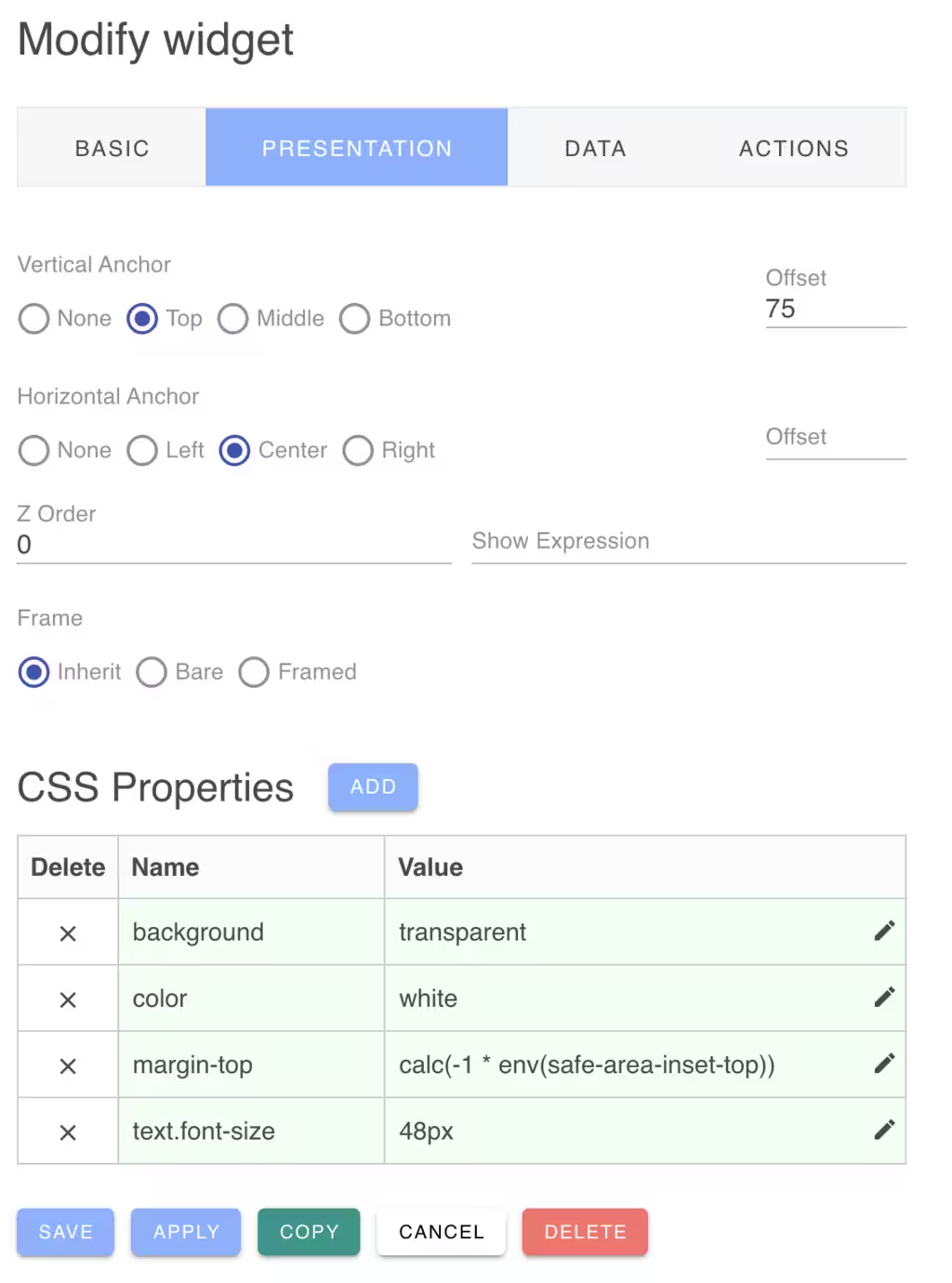
Anchoring Widget Position
If you are using the Exact layout engine for your dashboard, you can anchor widgets to various positions of the dashboard. This is useful for example if you wish to anchor a widget to the bottom center of the dashboard.
You can select a vertical and and a horizon anchor position with an offset. The offset can be expressed as a number of pixels or as a percentage of the dashboard height/width.
If you are using the Grid layout engine, widgets will be always compacted on the grid and anchoring widgets is not compatibile with the grid placement strategy.
Z Stacking Order
With the Exact layout engine, widgets are permitted to overlap. You can define their stacking order by setting a positive z-index value for each widget. The default value is zero. You can also set the z-index by Cmd-Clicking on a widget to bring it to the foregound. This will set its z-index to the highest of all widgets.
Show Expression
You can define an expression to determine if the widget should be displayed. The show expression is a JavaScript like expression that is evaluated to yield a true or false result.
The show expression is provided with a context of variables that can be accessed by the expression. The widget data value is provided in the "value" named variables. You can test this result using a Javscript like expression. For example:
1 | |
Other context variables include:
| Variable | Description |
|---|---|
| agent | Browser user agent string |
| dark | True if in dark mode |
| design | True if the dashboard is in design mode |
| desktop | True if running on a desktop PC |
| framed | True if the dashboard is framing widgets |
| full | True if the dashboard is in full screen mode |
| height | The browser width dimension (navigator.innerwidth) |
| language | The configured browser language (navigator.language) |
| live | True if the dashtop has enabled live data updates |
| mobile | True if running on a mobile device (<= 640px width) |
| value | The widget data (or input) value |
| width | The browser height dimension (window.innerWidth) |
The query language supports the operators:
1 | |
These extension operators have the following meaning:
- a ^= b means a starts with the string b
- a ^!= b means a does not start with the string b
- a $= b means a ends with the string b
- a $!= b means a does not end with the string b
- a >< b means a contains the string b
- a <> b means a does not contain the string b
Sub-expressions can be grouped with parenthesis and the boolean operators && and || can group conditional operands.
Regular expressions (delimited by slashes) may be used with the "==" and "!=" operators. The regular expression can be on either side of the operator.
The expression language understands the types: Numbers, Boolean, String literals, Regular Expressions and null.
The expression is run-time limited to evaluate up to 50 terms. This is to protect your cloud against denial of service attacks.
CSS Properties
Widgets will initially display with a default theme based on the current light or dark mode. However, you can override any CSS property for the widget to customize the widget size, colors and style.
The Widget will also inherit any default widget CSS properties defined in the dashboard configuration.
The CSS Property name can be any standard CSS property name. For example:
| Name | Value |
|---|---|
| background | red |
If the property name is *class, the class name value will be added if the widget value is not zero (false). Otherwise the class name will be removed.
or it can use an enhanced encoding as follows:
| Name | Value |
|---|---|
| [expression:][components...][property] | [true-value][:false-value] |
The expression: is an optional expression that evaluates to a truthy value to determine if the CSS property is enabled or disabled. The expression can use the widget's value in the expression and the same set of context variables as for the show expression described above. For example:
If an expression is supplied, the property value can supply two colon separated values. If the expression is true, the value before the colon is used, otherwise the one after the colon. For example:
| Name | Value |
|---|---|
| value != 0:background | red:green |
If the expression evaluates to true, the background will be set to red. If the expression evaluates to false, the background will be set to green.
The components are an optional set of DOM classes to select widget subcomponents to style. For example:
This selects the widget child footer element with the footer CSS class. See the Widget Types documentation for the available components for each widget type.
Dynamic CSS Properties
Some widgets dynamically compute their CSS properties according to the size of the widget and placement on the dashboard. To override these dynamic CSS settings, use a --w- prefix for the CSS property. For example: