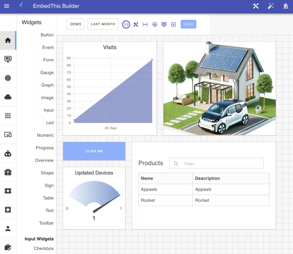
Dashboard Widgets
Dashboard Widgets present device and service service information in a discrete, graphical and interactive manner. Widgets can be combined to create integrated UI pages that focus on various aspects of your device and service.
The Dashboard supports over 30 different widget types that address a wide range of display and interactive input needs. These include: gauges, graphs, numerics, text, image, sound, and input widgets.
Adding Widgets
To add widgets to the dashboard, drag a widget from the widget sidebar toolbox to the desired location on the dashboard.
This will render a box where the widget will be placed and will then display the widget properties slide-out panel. From this panel, you can select your widget configuration.
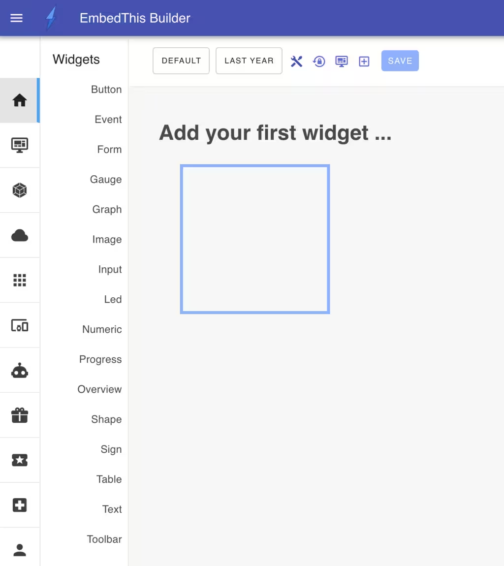
You can also add a widget by clicking on the "Plus" icon in the Dashboard toolbar.

Widget Configuration
When creating or modifying a widget, the widget modify panel is used to configure the widget type, presentation, style, data source and associated automation actions.
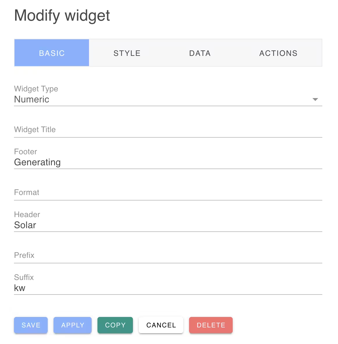
There are four tabs to control the various aspects of a widget:
| Name | Description |
|---|---|
| Basic | Widget type and extra output fields |
| Style | Widget position and styling |
| Data | Data source for the widget |
| Actions | Automated action to run when the widget is activated |
From this panel you can save your changes and click Apply button if you wish to save changes, but keep the panel open for futher modifications.
Deleting Widgets
From this panel you can also delete a widget or copy a widget to a new widget.
To learn more: